Table of Contents
A good website design should accomplish its goal of communicating a specific message while also engaging with the visitor. Consistency, colors, font, imagery, simplicity, and usefulness are all characteristics that contribute to successful website design.
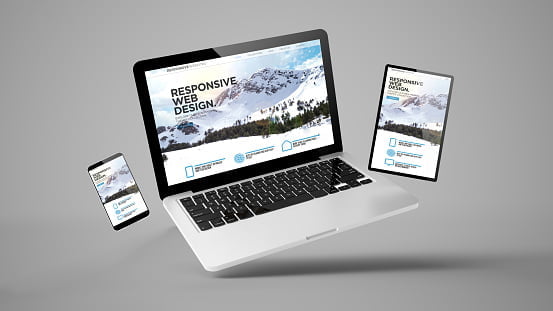
There are several important elements to consider while developing a website that will influence how it is perceived. A well-designed website can aid in the development of trust and the prompting of visitors to take action. Ensuring your website design is optimized for usability (form and aesthetics) and easy to use is part of creating a great user experience (functionality).
The things to consider.
WEBSITE PURPOSE

The user’s requirements must be met by your website. On all pages, having a straightforward, clear goal will assist the user in interacting with what you have to offer. What exactly is the goal of your website? Are you disseminating useful knowledge in the form of a ‘How to Guide’? Is this an amusement website, such as sports coverage, or are you trying to sell a product to the user? Websites can serve a variety of purposes, but there are a few that are similar to all of them:
- Describing expertise
- Building you credibility
- Generating leads
- Sales and good customer service
SIMPLICITY
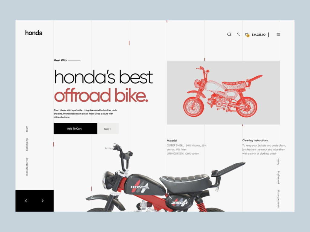
When it comes to the user experience and usability of your website, simplicity is the way to go, and here are some design ideas for achieving simplicity.
Color
Color has the ability to convey information and elicit emotional responses. Finding a color palette that is appropriate for your business can allow you to impact client behavior. Keep the color palette to no more than five hues. Complementary colors look great together. Color choices that are pleasing to the eye improve consumer engagement and make the user feel happy.
Type
On your website, typography plays a crucial function. It catches the eye and serves as a visual representation of the brand’s voice. Typefaces should be readable, and only three different fonts should be used on the website.
Imagery
Every visual part of communication is referred to as imagery. Still, photography, artwork, video, and all forms of graphics are included. All images should be expressive, represent the company’s attitude and serve as an extension of their brand personality. The majority of the information we consume on websites is visual, so it’s critical to use high-quality photos as a first impression to give visitors a sense of professionalism and credibility.
NAVIGATION
On websites, navigation is a wayfinding system that allows users to engage and find what they’re looking for. The ability to navigate a website is crucial to retaining visitors. If the website navigation is difficult to use, users will abandon the site and look for what they need elsewhere. It’s critical to keep navigation clear, intuitive and consistent across all pages.
F-SHAPED PATTERN READING
The F-based pattern is the most popular approach for website users to scan material. According to eye-tracking studies, the majority of what individuals see is on the top and left sides of the screen. The F-shaped layout is modeled around our natural reading pattern in the West (left to right and top to bottom). A well-designed website will make use of a reader’s natural skimming habit.
VISUAL HIERARCHY
The arrangement of things in order of importance is known as the Visual Hierarchy. Size, color, images, contrast, font, whitespace, texture and style are all used to achieve this. Establishing a focal point that shows visitors where the most significant information is, is one of the most important tasks of visual hierarchy.
CONTENT
Both outstanding design and terrific content are required for a successful website. Great content can attract and influence visitors, transforming them into clients, by using captivating language.
GRID BASED LAYOUT
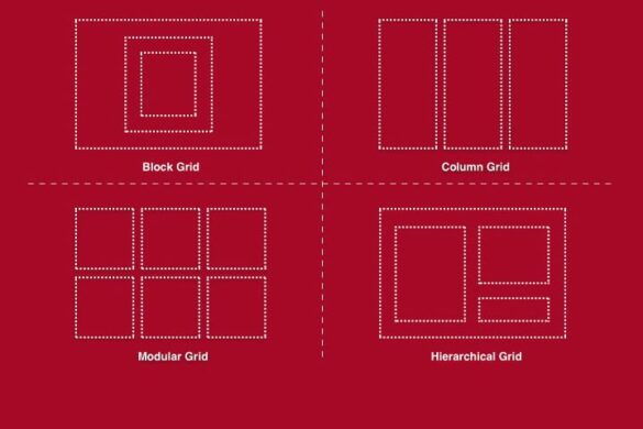
Grids aid in the structure of your design and the organization of your information. The grid aids in the alignment of things on the page and helps to keep it tidy. The grid-based layout organizes content into a neat, rigid grid structure with columns and sections that line up, seem balanced, and enforce order, resulting in a visually appealing website.
LOADING TIME
Visitors will leave if they have to wait for a website to load. Nearly half of web users anticipate a site to load in two seconds or less, and they may abandon a site that takes more than three seconds to load. Increasing the size of your images will help your site load faster.
MOBILE FRIENDLY
People are increasingly using their phones or other gadgets to access the internet. It’s critical to think about designing your website with a responsive layout that adjusts to multiple screen sizes.
Key takeaway:
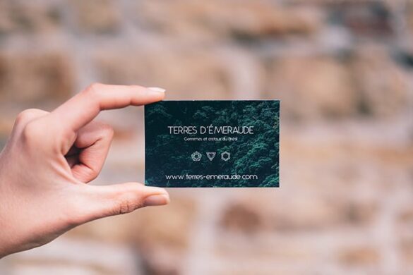
Essentially, your website serves as a digital business card. It’s what everyone sees when they think of doing business with you, including your clients, stockholders, friends, family, and cat.
Maintaining the appearance of your website ensures that everyone who visits it perceives you as trustworthy, professional, and worthy of doing business with.
A strong website also attracts visitors from Google, receives links from respected sites, and is shared more frequently.
Our team will bring your website to life and communicate your story. We are a team of designers, marketers, and technologists who work together in the areas of design, marketing, and technology. To learn more, Get in touch with us.
Results-driven web design services
Ensure that your future website is growth-oriented, resulting in more traffic and conversions.




Add your first comment to this post